How to: Frame Art Like a Pro

How to: Frame Art Like a Pro

how to frame art like a pro

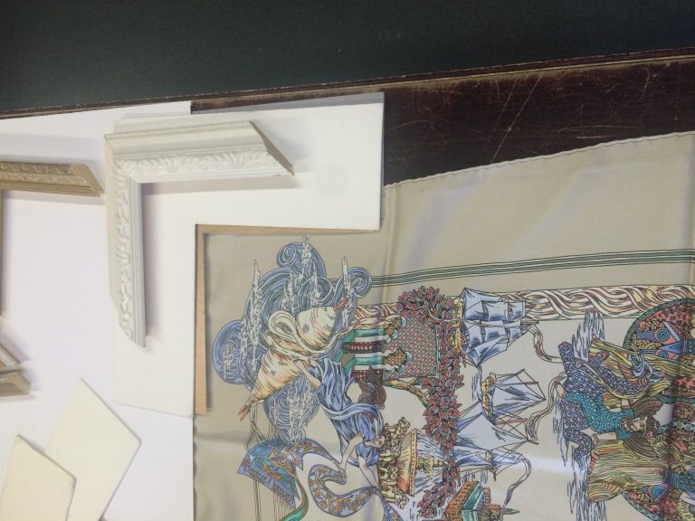
Framing art is an art in itself. I enjoy enhancing the art through the framing treatment to make it more fabulous, and over the years I’ve framed a lot of art. One client buys art just so I can frame it for him! He’s already warned me that more is coming my way…I’m really looking forward to that 🙂

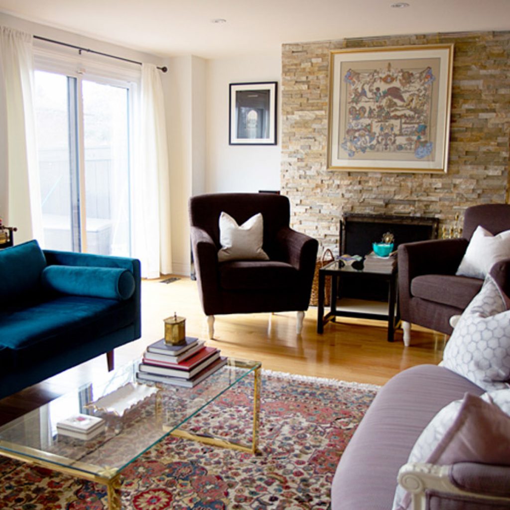
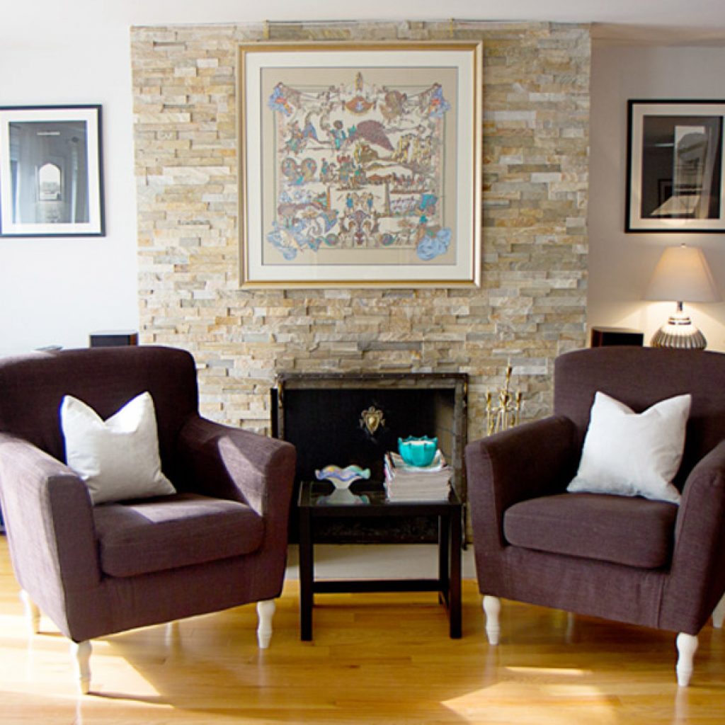
When I was creating the salon wall in my place I was super excited, the art and native prints were a lot of fun to put together. One thing to remember though, framing is expensive so be sure you’re making a timeless decision and can live with it for many years to come.

1.


OVERALL STYLE
OF THE SPACE

The first thing to establish is what the style of the space is, the framing should compliment that style. My own space is eclectic so I could do pretty much anything with my frames, generally I tend to stay away from the very ornate traditional style. Unless, of course, if you are intentionally and specifically going for that look. And, if you do have an ornate frame that you want to use in a modern space, painting it in high gloss white or black can give it a modern look.

2.

WHAT TO HIGHLIGHT

It is crucial that when framing art, the goal is to bring attention to a certain part of the picture. Generally speaking, try to create balance by pulling a colour from within the artwork, but one that is just a highlight. Many times,  I have seen the dominant colour being used in the frame which blends the frame right into the painting. A big no, no in my world.

Art and accessories are what set the mood in a space and shows your personal style. Recently I framed a vintage Hermes scarf for a client who is a fashion-nut. It was easy for me to pick the frame as I knew the space where it was going to hang has a lot of dark pieces around it. Because I wanted this particular piece to be the focus, and to break from the darkness on that wall, we decided to highlight the lighter parts of the piece and went with a light and fresh looking frame. Here is another different treatment of a similar Hermes scarf, where this choice is appropriate for more kinds of spaces.

3.

MAT AND FRAME

Matting adds negative space allowing your eye  to go straight to the art. It’s a good idea to try a few different combinations of matting and frames, take pictures, and bring them back into your space to see what you like.

I like to try grouping different coloured frames in a room and stay away from a matching – that’s my eclectic aesthetic showing through – however they should all compliment each other in some way. For instance, if you have all black frames, throwing in an accent colour or a tan frame would break the monotony and bring attention to your favourite piece. When picking the frame, keep in mind that it should just compliment the art and not overpower it.

Welcome!

Hey… I’m Naveed,

a designer of beautiful interiors & a curator of beautiful things

designing a home unique to your specific style, influences your mood and your overall wellbeing. Your home becomes a source of inspiration for you and alleviates stress.

Don’t be overwhelmed with your next renovation or decor project, we have it all streamlined.

All you need is one trustworthy person for the success of your project… I’m here to help!

Posted in Projects and tagged , , , , , .